
The true size of Africa: this is the map that most accurately reflects the continent

Two African organizations, Speak Up Africa and Africa No Filter, have launched the Correct The Map campaign, which advocates replacing the traditional world map with one that more accurately preserves the proportions of the continents.
On the classic planisphere, created by Gerardus Mercator in 1569, Africa appears dwarfed compared to other territories such as Greenland or Canada. This is because the map, which was created to facilitate navigation, causes greater distortions as one approaches the poles, so Greenland appears similar in size to Africa, when it is actually about 14 times smaller.
It's impossible to project a sphere onto a two-dimensional surface without some distortion in shape or angles. Each projection has its advantages, disadvantages, and distortions, which, in the case of Mercator, affect the size of the continents. "The true reference would be a three-dimensional globe that you can touch and hold. But obviously, that only shows half of the Earth. That's why we create world maps to show the entire planet," cartographer Bernhard Jenny of Monash University (Australia) explains to EL PAÍS.
The Correct the Map initiative calls for the adoption of less distorting projections, such as Equal Earth , to better reflect Africa's size relative to the rest of the world. The African Union (AU) has just endorsed this demand, which proposals such as those promoted by Speak Up Africa and Africa No Filter have revived in a time of post-colonial rupture and the reaffirmation of African identity.
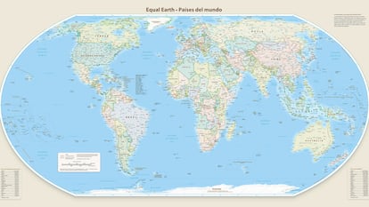
The Equal Earth projection was created in 2018 by Bernhard Jenny, Tom Patterson, and Bojan Šavrič. As its authors explain, it is a pseudocylindrical projection with equal areas across its entire surface. Its features include “an overall shape similar to the Robinson projection, which, while popular and pleasing to the eye, does not have equal areas like the Equal Earth projection,” curved sides that suggest the spherical shape of the Earth, and “straight parallels that facilitate comparing the distance north or south of the equator,” they state on their website .
“What we hope is to give people a better understanding of the relative landmasses, how continents are formed, and how large different parts of our world are. And to also offer a better option when they want to create a map or need one,” explains Jenny, co-creator of Equal Earth. The Monash University professor adds that cartographer Tom Patterson, another of the projection's creators, created a series of world maps using Equal Earth. These planispheres can be downloaded for free from the website.
If you want to know the reasons why the Correct The Map proponents are replacing the Mercator planisphere with the Equal Earth planisphere, you can read the article: “Maps are not innocent drawings”: Africa demands a change in cartography that shows the continent's true size.
Do you want to add another user to your subscription?
If you continue reading on this device, it will not be possible to read it on the other device.
ArrowIf you want to share your account, upgrade to Premium, so you can add another user. Each user will log in with their own email address, allowing you to personalize your experience with EL PAÍS.
Do you have a business subscription? Click here to purchase more accounts.
If you don't know who's using your account, we recommend changing your password here.
If you decide to continue sharing your account, this message will be displayed indefinitely on your device and the device of the other person using your account, affecting your reading experience. You can view the terms and conditions of the digital subscription here.
EL PAÍS


